Concept
Latimer Terraces is a 20-unit development of urban housing within One Central in central Christchurch. Commissioned by Crown entity Otakaro as part of the urban regeneration after the devastating 2011 earthquakes, the development by Fletcher Living at the centre of this area was the first of many. The concept for this project was to aim high, with excellent quality of design being a leading identity for the area. Drawing on many time-honoured precedents of quality urban townhouses in Canterbury over the years, many of which were destroyed either in the earthquakes or by over-eager engineers and insurers in later years, the Latimer Terrace project replaced ageing brick and concrete office buildings Avonmore House and Torrens House.
One Central
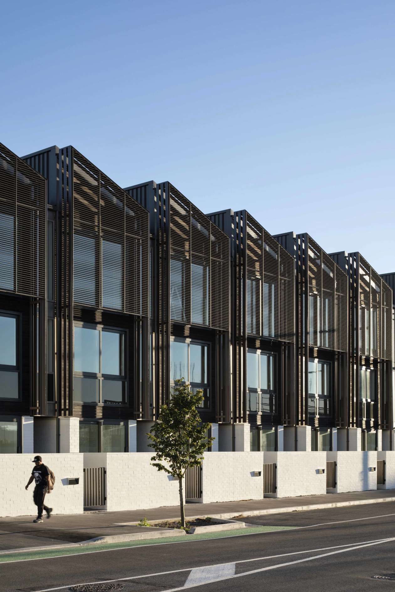
Photo courtesy of Simon Wilson
Context
Despite the large suburban presence it has now, Christchurch was in many ways a successful urban city for many years prior to the quakes. Housing developments such as the St Mary’s apartments (architect: Peter Beaven), the Christchurch Arts Centre (architect: Benjamin Mountfort), or 65 Cambridge Tce (architect: Warren and Mahoney) have all proved to be well-designed and long-lasting as urban residences, while the Canterbury style of steep gables, bagged white blockwork and crisp architectural detailing has never gone out of style. The site was one of several large ‘super-lots’ created by amalgamating former property boundaries.
The site (Superlot 4) is next door to the upmarket Christchurch Club, virtually the only building still standing in the area after the quakes and the resulting clean-up phase, now restored and substantially rebuilt by Warren and Mahoney. The site is located immediately to the east of central Christchurch, between an area of dense suburban housing and a low-rise commercial area which was wiped clean after the quakes to create Rauora (originally named The Frame), a clean green longitudinal public park. The idea of Rauora was to build a ring of green space around the central city, with the continuation of suburbia outside of Rauora, and urban densification within. It is a dead flat site, with a gravelly soil, as is most of Christchurch, but fortunately it adjoins Latimer Square, one of the original genteel squares of the garden city. The urban nature of Latimer Square demands a confined edge of buildings, preferably residential, and now the Christchurch Club sits comfortably amongst its neighbours. Flat green lawns, large deciduous oak trees, and in winter months, a glimpse of far-off Southern Alps glistening with snow- capped peaks.
Site Aerial
One Central
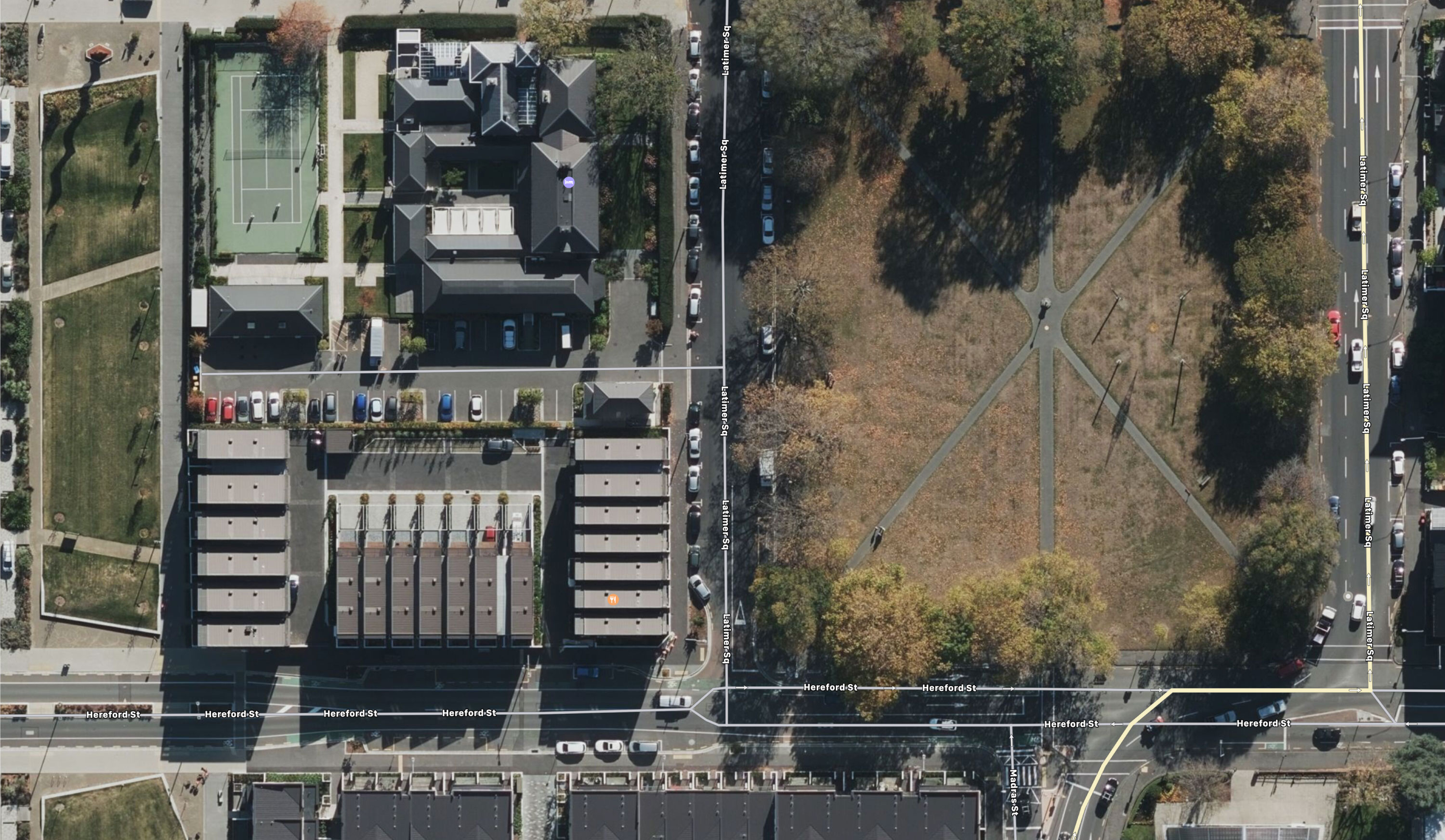
All drawings courtesy of Warren and Mahoney
Site Plan - Ground Level
One Central
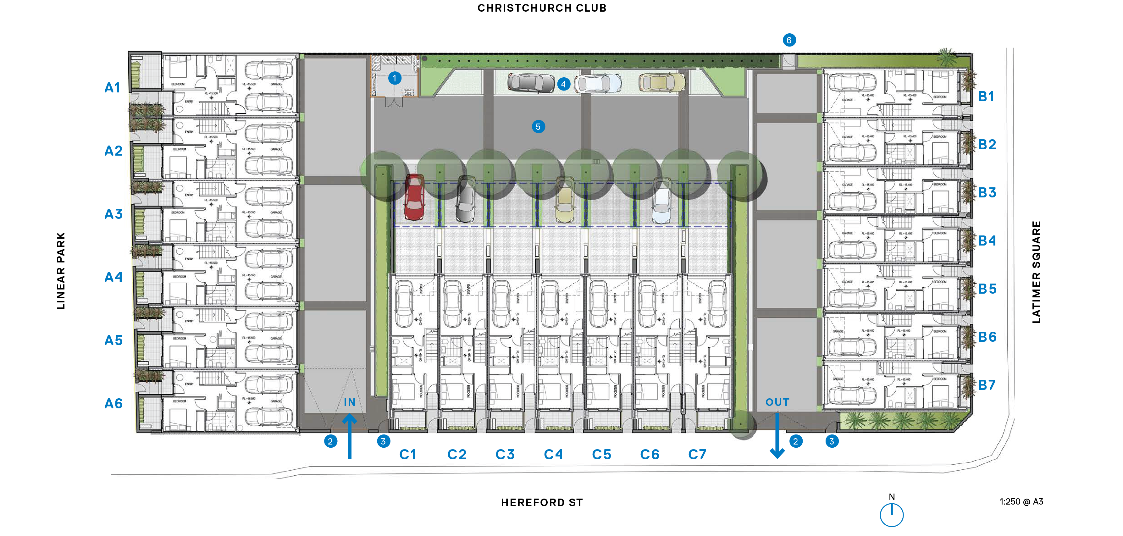
Key
- Services enclosure
- Vehicle gate - motorised pedestrian gate
- Residents’ parking
- Landscaped courtyard
- Boundary fence and gate to Christchurch Club
Planning
As the first of the new projects on site, this project got to set the scene. It is unashamedly upmarket, with large luxurious townhouses designed to try and attract people back from the suburbs. This was a bold move at the time, but has since paid off, with the townhouses being highly sought after. Other subsequent developments nearby (originally planned to be built first) such as Bedford Row have aimed at a more affordable price bracket, as the popularity of living in the East Frame area starts to grow.
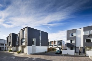
This project is composed of three separate blocks, surrounding a central paved courtyard. One block faces west to the grassy area of Rauora Park, another faces onto the lush existing greenery of Latimer Square, and the third faces directly north towards the newly restored Christchurch Club. Initial design considerations explored the idea of some two-storeyed buildings as well, but the final built outcome was that all the units would be three storeys high, with surface level car parking for guests just to the north.
Although the three blocks look similar, their planning is all slightly different. Block A, closest to Rauora Park, has garaging for two cars per unit at ground floor, while the other two blocks have room for one car each inside. Each townhouse has a ground floor flat that could be a self-contained unit – useful for when older relatives come to stay. Block A units are 5.8m wide and 210-215m² each, while Blocks B and C have widths of 4.5m and a smaller 164m² size. Planning for both types of units is similar throughout, with the middle floor being devoted to a vast open span of kitchen, dining and living, with two equally large bedrooms on the top floor.
Zoning the living spaces on the first floor allows for optimal privacy and views out, with only a single flight of stairs either up or down to bedrooms. While this is the opposite of traditional terraced houses, it was a fundamental principle of the design at the outset and project architect Richard McGowan notes there could be several different possible living and ownership scenarios: the traditional family, a semi-retired couple, a professional working couple, or two professional people who share ownership of the house (but don’t share a bed). The two bedrooms on the top floor are therefore not a master and a secondary room, but are equivalently sized, allowing for the possibility of co-ownership. The ground-floor bedroom with adjacent bathroom can act as a home office, or a rented bedroom, or a ground floor base for an older demographic.
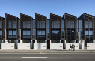
Living spaces get the access to the large balconies on each unit, while those capacious bedrooms up top gain privacy and great views through the black external louvres that give this project so much of its mystique and success. The top floors all feature high ceilings under a skillion roof, along with twin bathrooms of equal size up top. Roofs are all aligned to face north, to make it simple for solar PV to be attached at some date, which means that the project does not have perhaps quite the amount of variation that the architects would have liked on the roofline.
Type A - Sectional View
One Central
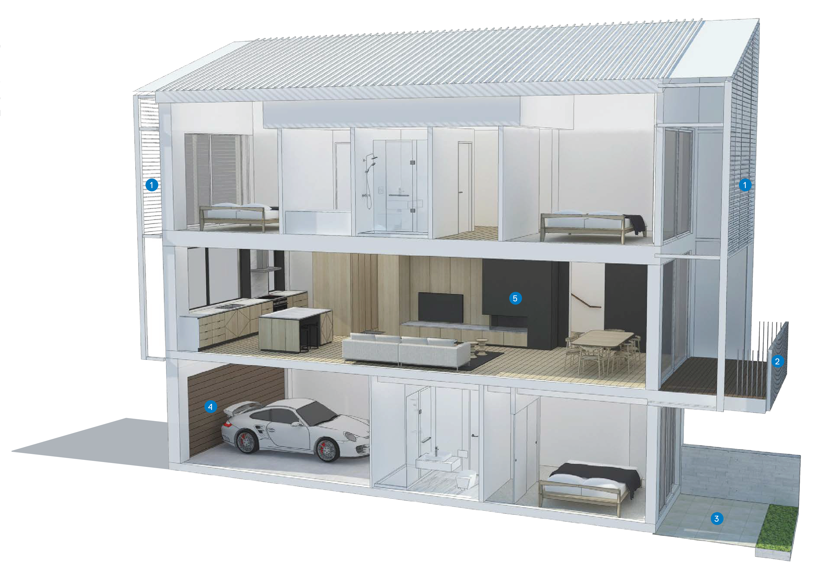
Key
- Aluminium louvred sunscreens
- Deck and balustrade
- Private courtyard
- Sectional garage door
- First floor living / dining
Type A - Floor Plan
One Central
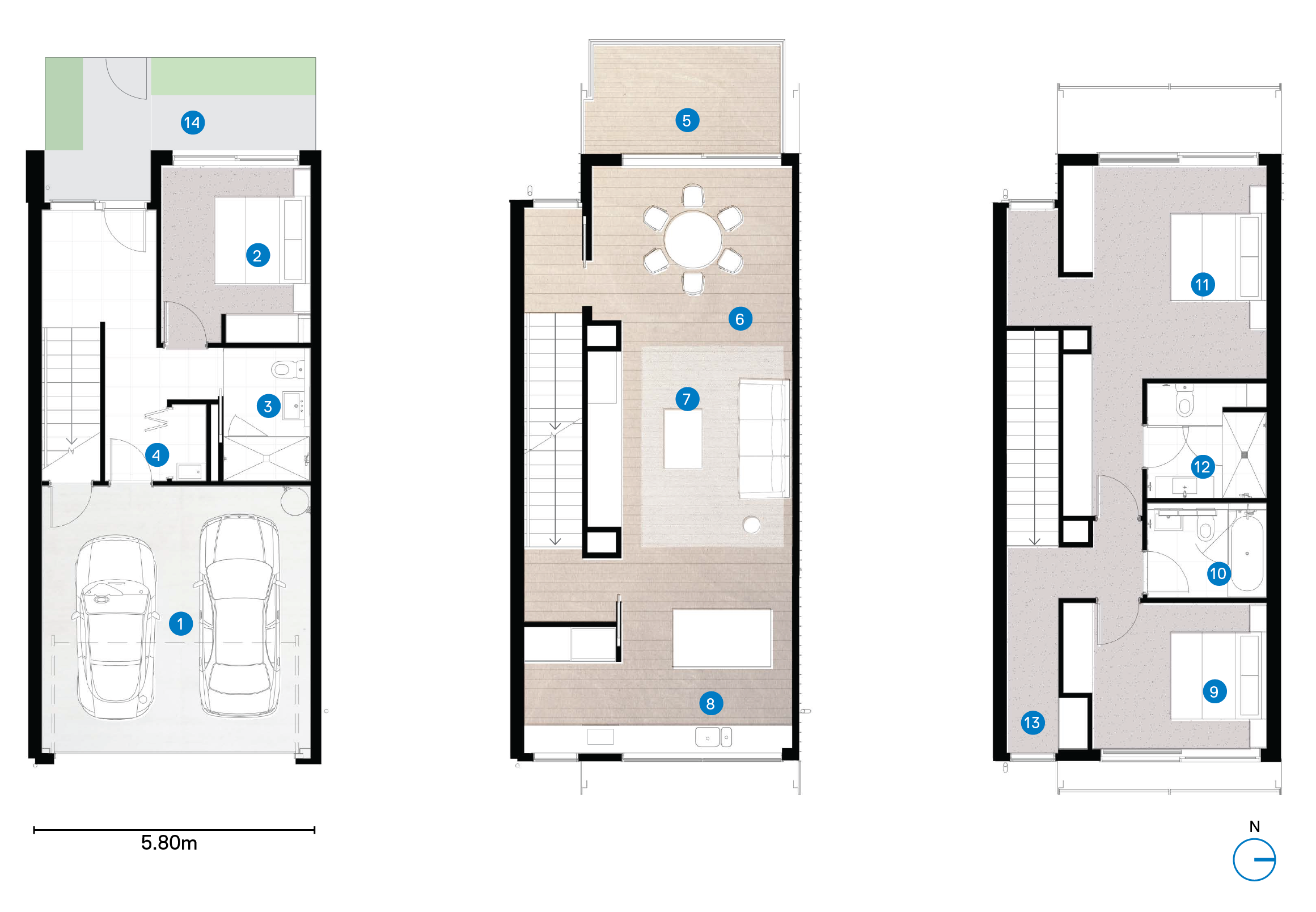
Floor area = 210m²
Key
- Garage
- Bedroom 3
- Bathroom 2
- Laundry
- Deck
- Diniing
- Living
- Kitchen
- Bedroom 2
- Bathroom 1
- Bedroom 1
- Ensuite
- Study
- Private courtyard
Type B Sectional View
One Central
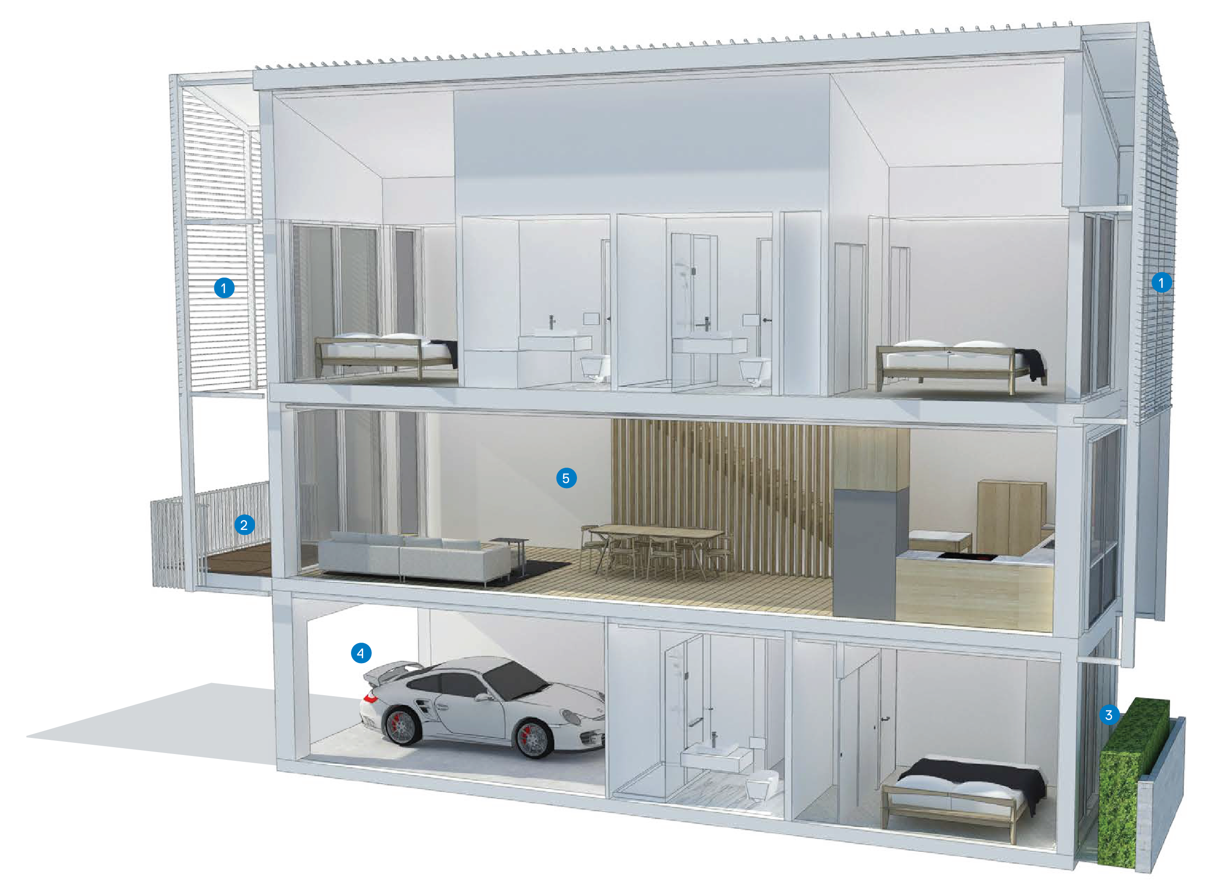
Key
- Aluminium louvred sunscreens
- Deck and balustrade
- Private courtyard
- Sectional garage door
- First floor living / dining
Type B Floor Plan
One Central
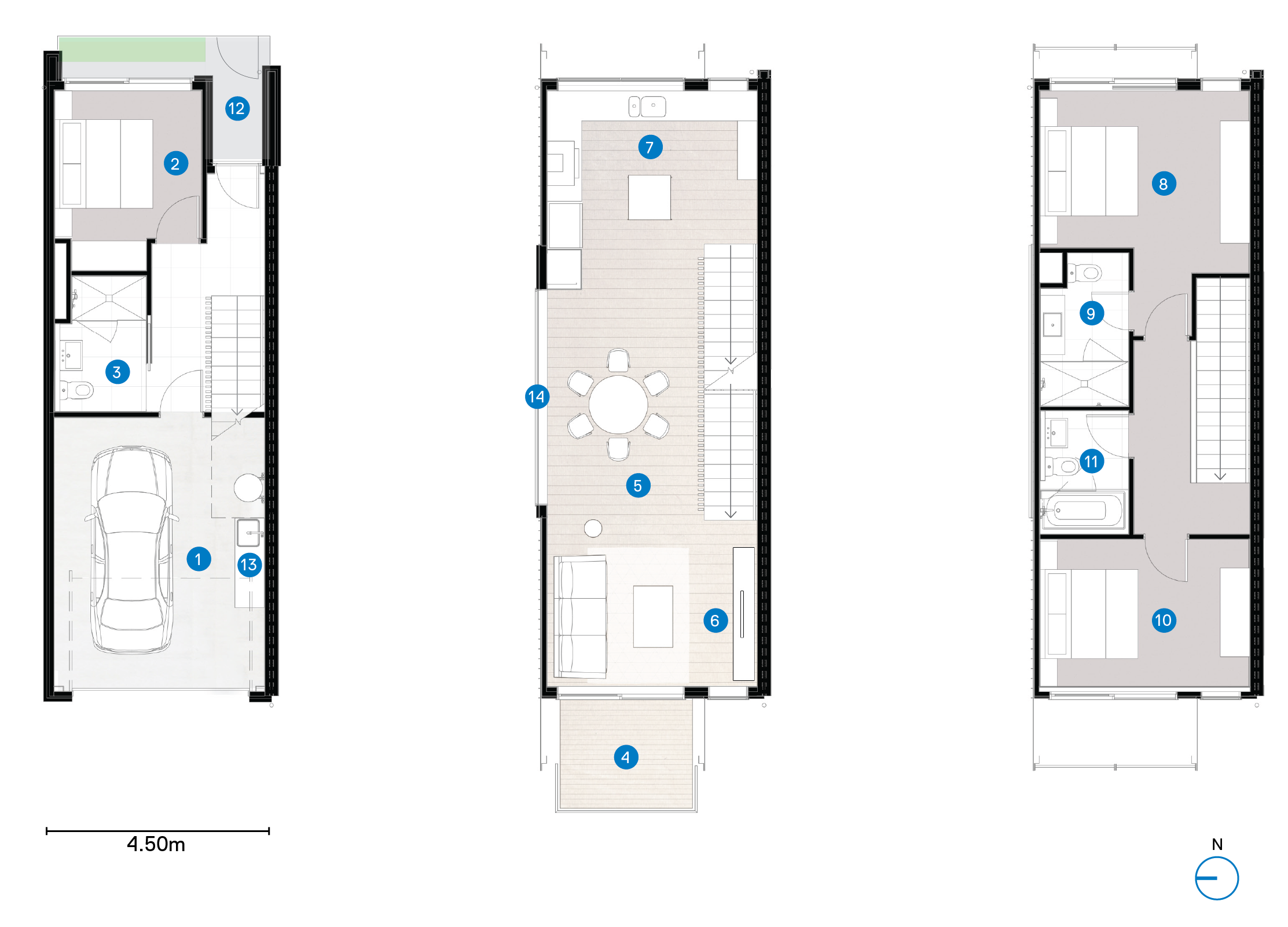
Floor area = 164m²
Key
- Garage
- Bedroom 3
- Bathroom 2
- Deck
- Diniing
- Living
- Kitchen
- Bedroom 1
- Ensuite
- Bedroom 2
- Bathroom 1
- Private courtyard
- Window on end units
Construction
Developer Fletcher Living was keen to pursue their traditional methods of construction using timber frame construction, with aerated concrete inter-tenancy walls, but project architect Richard McGowan notes that a more typical system for Canterbury would have been to use precast concrete panels for ITW and external façade walls. Indeed, precast ITW panels were adopted by Fletcher Living for subsequent lots. The flooring system used by Fletcher Living was a prefabricated timber cassette that could be easily dropped into place for those two middle floors, with the ground floor being in-situ concrete. Steel portal frames at key points within, both support the floors and are used as moment frames to give transverse bracing to the townhouse’s large glazed frontages.
The project keeps to the traditional Canterbury palette of white blockwork (outside), creating a comfortable breathing space from the public realm, and allowing small garden areas to be kept.
Elsewhere, the colour scheme is resolutely black and timber, with the external aluminium louvres being a strong design feature. The louvres appear delicate, fine, and are poised off an unusual three dimensional projection, rather than being housed within a more bulky external frame as others may have done. This helps to set the private zones of the house back slightly, affording another layer between the public realm outside and the private living spaces within.
Sustainable principles were at the forefront of the design with the project achieving Homestar 6 certification by the New Zealand Green Building Council. Provisions included pre-wiring for solar PV panels for when the owners decide to implement that, and in the same way, electric car chargers have been pre- wired into the ground floor, ready and waiting for the inevitable purchase of an EV.
The development has achieved Lifemark 4 certification which future-proofs lifestyle and investment, and allows the occupants an exciting urban experience at any life-stage, further contributing to the vibrancy of the city.
Individual ducted heat pump systems were provided for each unit, with a combination of natural ventilation and night-time mechanically-assisted ventilation as required by local codes (responding to concerns of reverse sensitivity for urban noise). There is also the opportunity for individual owners to retrospectively fit gas fireplaces as part of their subsequent occupation of the units, as the gas lines have been pre-installed.
As befits high-end residential, bathrooms and kitchens are all top quality design, with comfortable room and quality fixtures and fittings. Due to the need for the design to accommodate two couples, each bathroom on the top floor is fully spec’d, and the bedrooms are discreetly hidden behind the black external louvres. As befits a project in Canterbury, all of the glazing is double glazed, and the roof is well insulated (above Code). External façades are reduced almost entirely to glazing due to the expanse of glass at each floor level, but nonetheless keep up the rhythm of one tall thin window and one wider sliding glazed unit per floor. Roofing to the units is long-run, with the characteristic Canterbury prickle to the apex of each mono-pitch roof. The solidity of the white bagged blockwork surrounding each entryway contrasts nicely with the fine, refined, sharp angularity of the impeccable external louvering to the highest floor.
One Central
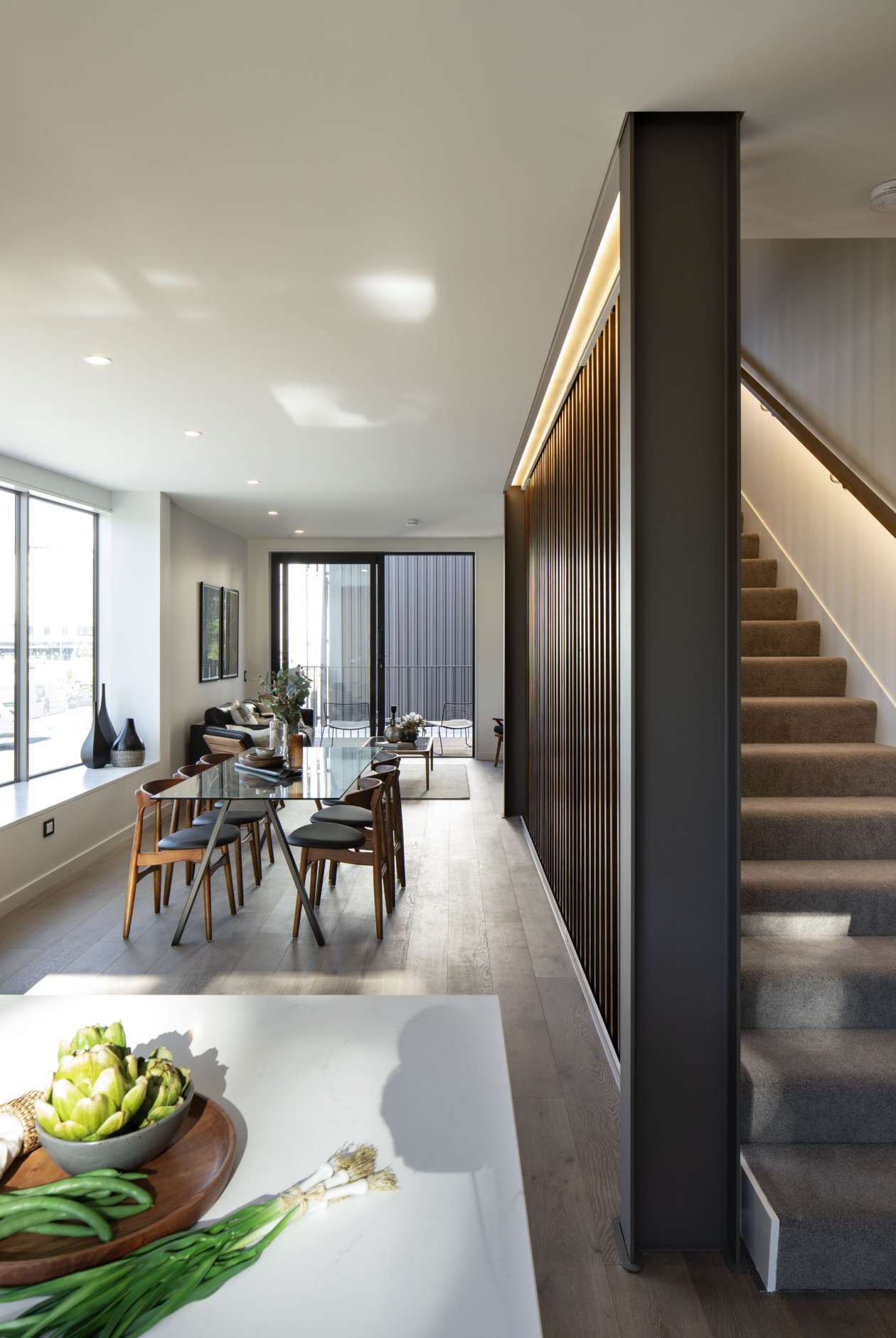
Photo courtesy of Simon Wilson
